The Skelta Workflow.NET Process Designer is the main user interface of Skelta Workflow.NET. The workflow process is designed and deployed from this window. It opens when the Process Designer control is executed from a Web Form in the Web Application.
The Process Designer is an ASP.NET server control that can be embedded in any Web based product, ASP Engine or Web Page. It is browser based requiring no plug-in or IDE. It provides complete drag & drop and link functionalities to design your processes. The Process Designer has two areas:
The Process Designer user interface has four parts –
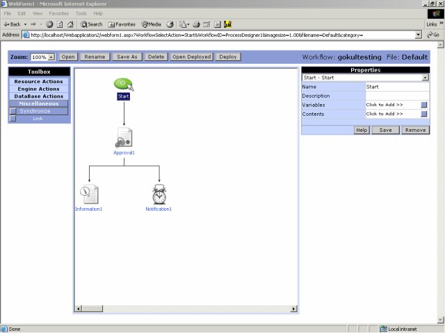
These are described in separate sections. The Process Designer screen is shown here with the Properties pane for Start action.
Process Designer Screen

Tool bar
The Tool bar is located at the top of the Process Designer window. It has the following controls that perform key functions.
See also Tool bar Popup Windows for more details on the popup windows opened by each tool.
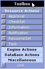
Toolbox
You can use the Toolbox to access the different actions that can be used to design the workflow in the Process Designer. There are sixteen menu options in four menus in addition to one action that is not part of any menu. These correspond to the standard actions available with Skelta Workflow.NET. A fifth menu – Custom Actions, is added to the Toolbox whenever a custom action is defined for a workflow process. Each menu groups a set of related actions dealing with the following common activities:
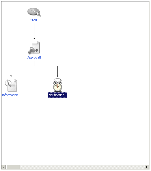
Design Area
You can create and edit workflows in the Design Area. Initially it displays only the icon for the Start action. You can drag and drop the different actions from the toolbox to the Design Area. This will display the icons corresponding to the selected actions on the Design Area. Alternatively, you can also display the action icons on the Design Area by clicking on the corresponding actions in the Toolbox. After displaying the action icon you can use the Link tool to link it to the workflow.
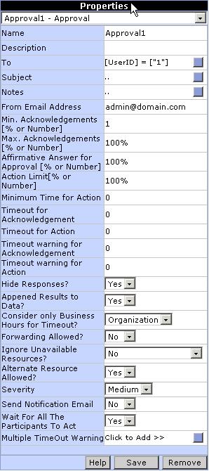
Properties Pane
The Properties Pane at the right of the screen shows the property fields corresponding to the selected action. This image shows the Property Pane for the ‘Approval’ action.